Organization: Design Bloc at Georgia Tech
Timeline: July 2021 – December 2021
Role: Designer / Researcher
Highlights
Challenge:
The Hunter Hills neighborhood was undergoing rapid change due to gentrification, and generations of residents worried that the neighborhood’s Black history would be lost in all the change.
Impact:
The brand carried forward the history and legacy experienced by long-term residents through visual iconography with immediate applications on the neighborhood’s website, t-shirts, and a welcome sign.
Methods:
We conducted 30 qualitative interviews with long-term residents, employed surveys to receive quick feedback on logo sketches, and offered multiple co-design workshops for residents to shape the design of their brand.
Recruitment
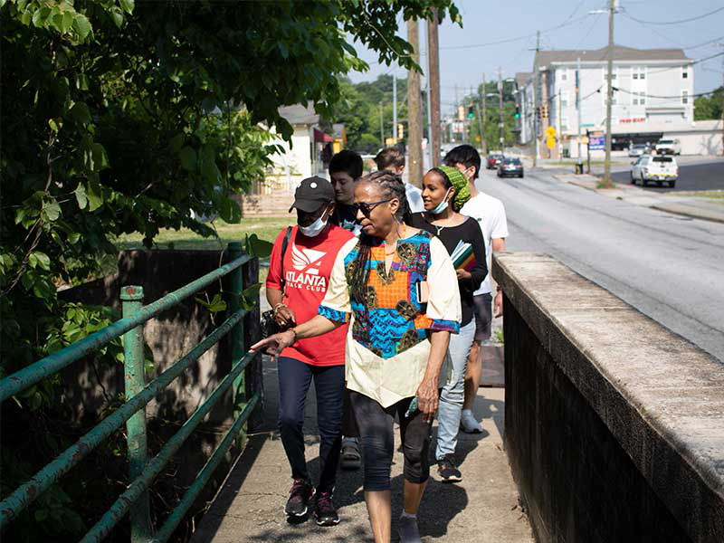
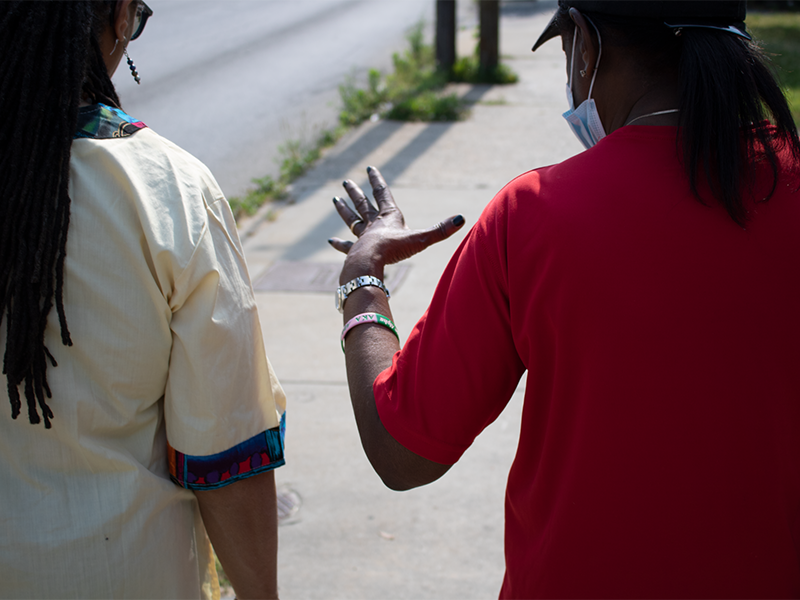
Residents had bad experiences with companies and universities trying to “fix” issues in the neighborhood in the past, so we knew the first step was to get to know residents and build trust with the community through real face-time.
As a team, we got to know residents by helping out with weekend neighborhood cleanups, walking through the neighborhood with residents as guides, and conducting interviews with residents in the community.
As an interviewer, I facilitated conversations with residents about their memories and perspective on the neighborhood.
Using Miro, an online whiteboarding software, we documented key quotes from 30 total interviews and began tagging them into thematic buckets.
One of the key challenges in this process was treading the line between identifying themes and imposing our own biases onto the qualitative data.
To overcome this, we generated statements that summarized common sentiments from thematic buckets, then shared these statements back to residents via a Qualtrics survey with the option to select which statements resonated most with their point of view. The result was a prioritized set of sentiments around common themes.
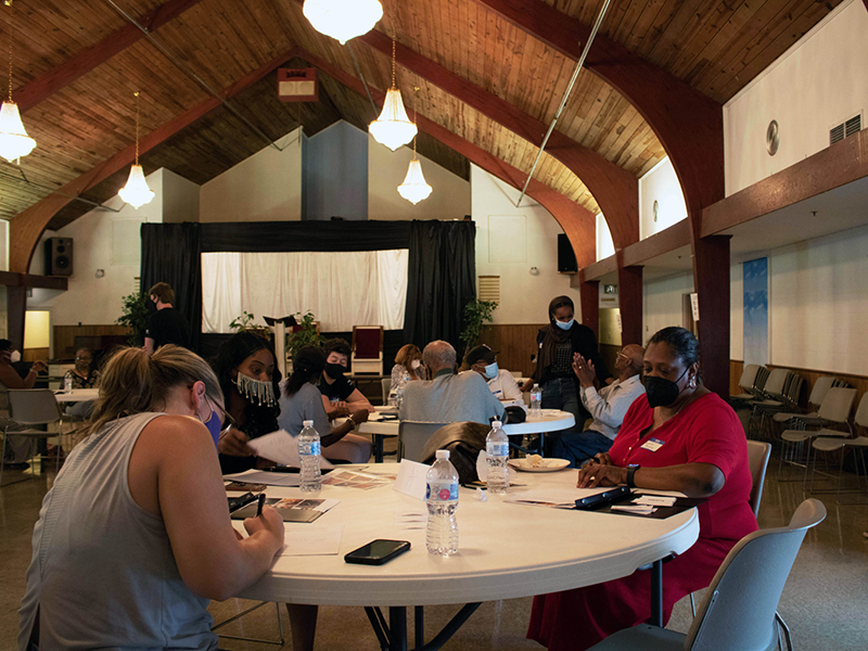
Co-Design Workshops
We worked with the community to organize an open co-design workshop in the Hunter Hill First Baptist Church and one-on-one in resident’s homes. Residents connected the themes we’d synthesized from interviews to visual iconography that resonated with them.
We designed worksheets that helped residents associate themes from interviews with visual design elements.
The goal of the workshop was to give residents power to shape the brand, while still keeping it fun and engaging.
My teammate moderated discussion during the session, and we all reviewed written and verbal feedback from residents in the workshop to define a final set of descriptors and images to inspire the brand.
It was important to us that the workshops were accessible, so we conducted one-on-one versions of the activity with some residents at home per their request.
We used the feedback from co-design workshops to focus in on 4 key adjectives for the neighborhood identity. These descriptors and images chosen from the workshop became the inspiration for logo design, font selection, and icon options.
Visual Prototyping
With the resident-defined moodboards and core values as our bedrock, we began generating concepts for a logo and iconography that would communicate the identity of the neighborhood.
Starting on paper, we each generated page after page of potential icons and logos for the brand, based on the inspiration moodboard defined in co-design workshops.
I learned how to rapidly generate icons with pen and paper on the fly, with plenty of help from my design teammates.
Each teammate presented one logo concept to the neighborhood for review and feedback. My concept pulled from the relationship of mutual support between generations in the neighborhood. A design teammate helped me render potential applications on stationary and letterhead.
Final Feedback & Delivery
Using a qualtrics survey and live review session via Zoom, we put each of our teammates’ concepts for the Hunter Hills logo up to a vote by residents.
The clear winner – combined the two H’s of Hunter Hills, leveraged a pattern reminiscent of the hills in the neighborhood and colors inspired by the heavily wooded streets.
The final logo was decided by vote using a ranked choice questionaire sent out to all resident contacts in the community.
Our final deliverable to the Hunter Hills Neighborhood Association was a print and digital brand book outlining the core values defined through research, the origin of the logo, brand colors, brand fonts, and recommended use cases and applications. In addition, the neighborhood association received vector graphics of all brand materials for print and digital media.
Impact
The ultimate goal of the brand was to capture and carry forward the history and identity of the neighborhood in a design with wide-ranging applications for print and digital media.
Two years after the brand book was released, the Hunter Hills neighborhood is still using the logo, brand colors, fonts, and core values for their website, t-shirts, and social media posts.
Many thanks to the Hunter Hills Neighborhood Association and residents for their constant collaboration on this project.